


“Our ads look fine…
… so why do theirs spark conversations and ours barely earn a scroll-pause?”
If you’ve ever felt that twinge of creative envy watching a rival startup’s slick carousel or punchy pre-roll drive sign-ups while your own ad performance plateaus, you’re not alone.
Founders and marketing leads juggle product roadmaps, hiring, and funding—yet in the background, an endless torrent of brand messages hits every single prospect each day.
In this blizzard of impressions, attention is fiercely rationed.
Nielsen’s 2024 creative-effectiveness research shows that the quality of the visual and narrative itself, not just audience targeting, can swing both brand lift and sales outcomes.
In other words, smart bidding can’t compensate for a forgettable image or a limp opening line.
We have written this blog to make sure that you’re never the victim of a flopped ad creative. And to make that happen, in the next couple of minutes, we will:
- Dissect real startup ads to reveal why some ads get clicks while others fail.
- Share tested frameworks and tool stacks so you can audit competitors, prototype fresh creatives, and iterate with confidence.
- Share quick wins and pitfalls drawn from hands-on campaigns.
By the end, you’ll know exactly how to transform that nagging sense of “our ads feel flat” into a systematic teardown process that outperforms even the most polished rival creative without adding hours to your already packed calendar.
What is ad creative, and how is it different from ad copy?
Let’s clear up a common mix-up: ad creative ≠ ad copy. They work together, but they’re not the same.
Ad creative encompasses everything visual and structural that stops the scroll, including images, videos, layouts, carousels, animations, colors, and typography. It’s the packaging your audience notices first. Think of it as the first handshake: it either sparks curiosity or gets ignored.
Ad copy, on the other hand, comprises your headline, subhead, description, and CTA. It’s the part that persuades someone to take action after they’ve decided to pay attention. If the creative is the storefront, the copy is the pitch inside.
Let’s break down a high-performing example from the Meta Ad Library featuring Notion:
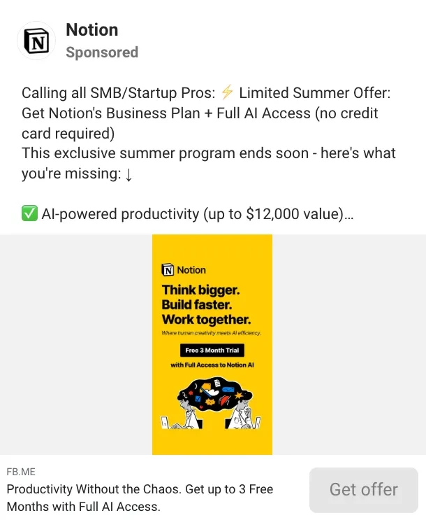
An ad by Notion
ual and clear offer messaging. What’s working?
- The visual is bright yellow with simple, bold copy: “Think bigger. Build faster. Work together.” It’s instantly scannable and hard to miss.
- The supporting text emphasizes urgency and value: “⚡ Limited Summer Offer: Up to $12,000 in value. No credit card required.”
- The CTA? “Get offer” — direct, action-oriented, and low-friction.
Together, the ad stops the scroll, clearly conveys value, and nudges action. Remove any one element and the performance drops.
Most creative audits get stuck tweaking copy or headlines. But the biggest performance levers often come from structure and visual clarity. The Notion ad works because every part — from color contrast and layout to urgency and CTA — reinforces the message.
So before you run your next split test, ask:
Is it the words… or is it the scroll-stopping power of the creative that needs work?
The startup founder's guide to competitor ad creative analysis
Every good ad represents a good monetary and time investment in testing and optimization. Smart founders and marketers don't just admire effective ads; they dissect them, extract the winning formulas, and adapt them for exponential growth.
This systematic approach transforms random inspiration into strategic intelligence, helping you skip months of expensive testing by learning from what's already working in your market.
Step 1: Create your intelligence matrix
Build a standardized analysis template with these columns:
- Hook/opening - The attention-grabbing element
- Visual strategy - Format, colors, focal points
- Copy approach - Tone, structure, proof elements
- Value proposition - Core offer and positioning
- Call-to-action - Phrasing, design, placement
- Landing page alignment - Message consistency and flow
Why this works: Your brain naturally seeks patterns. But without structure, you'll miss the subtle connections between high-performing elements. A standardized matrix forces you to examine every ad through the same analytical lens, transforming random observations into actionable intelligence. Most founders analyze ads emotionally ("I like this design"), but systematic analysis reveals the mechanical reasons why ads actually convert.
How to implement: Create a simple spreadsheet or use a tool like Notion. For the first week, analyze just 3-5 ads to get comfortable with the framework. As you fill in more data, patterns will emerge that would be invisible through casual observation.
Result: After cataloging 20-30 ads, you'll start seeing the matrix that governs your market. You'll notice that 80% of successful ads in your space use similar emotional triggers, or that certain visual formats consistently outperform others. This is simply your audience revealing their preferences through their engagement patterns.
Step 2: Decode the thumb-stopper
Identify the psychological trigger that breaks the scroll:
- Relief-based: "Stop losing leads to manual follow-up"
- Aspiration-driven: "Scale to 7-figures with automated workflows"
- Fear-motivated: "Your competitors are already using this"
- Curiosity-sparked: "The metric that predicts churn 90% of the time"
Why this works: The human brain processes 11 million bits of information per second but only consciously notices about 40. In a social media feed, you have roughly 0.3 seconds to interrupt the scrolling pattern before users move on. Successful hooks exploit fundamental psychological drivers that have evolved over millennia, such as our need for safety (fear), improvement (aspiration), comfort (relief), and knowledge (curiosity). These aren't marketing tricks; they're hardwired responses that bypass rational decision-making.
How to implement: When analyzing an ad that actually made you pause, ask: "What emotion did I just feel?" Then identify the specific words or phrases that triggered that emotion and categorize them into the above-mentioned themes. Most winning ads combine multiple triggers, so don’t get confused when you see an amalgam.
Result: Your hook library becomes your unfair advantage because most founders start with their product features rather than customer emotions. When you lead with proven psychological triggers adapted to your unique value proposition, you're speaking the language your audience's subconscious already understands.
Step 3: Map the visual psychology
Analyze how design elements guide attention and build trust:
Format choices:
- Static graphics for clear value demonstration
- Video for product demos and social proof
- Carousels for feature comparisons or testimonials
Trust signals:
- Human faces for relatability and credibility
- Product screenshots for proof of concept
- Customer logos for social validation
- Clean interfaces for professionalism
Result: This will help you to note down your customer’s visual psychology. Remember, your visual strategy should match your customer's decision-making style. B2B buyers often need proof and professionalism, while B2C customers respond to emotion and aspiration.
Step 4: Analyze the persuasion architecture
Examine how copy moves prospects from awareness to action:
Message structure:
- Headlines that promise specific outcomes
- Bullet points highlighting key benefits
- Social proof is woven throughout
- Objection handling in the copy flow
Authority markers:
- Statistics and performance metrics
- Customer testimonials and reviews
- Industry partnerships and certifications
- Media mentions and awards
Why this works: Persuasion isn't manipulation; it's structured communication that helps people make decisions in their own best interest. Your prospects are bombarded with choices and paralyzed by options. Effective copy acts as a guide for them, providing the logical framework and emotional reassurance needed to move forward. Each element serves a specific psychological function: headlines create focus, benefits paint possibility, social proof reduces risk, and objection handling removes barriers.
How to implement: Read the copy aloud and notice where you feel convinced, confused, or skeptical. Mark each persuasion element with different colors or symbols. Pay attention to the sequence — how do they build the case? Do they lead with benefits or problems? When do they introduce proof? How do they address common objections? Look for transitions between paragraphs that maintain momentum and prevent drop-off.
Result: Layering multiple persuasion elements creates exponential rather than additive impact. A benefit statement alone might slightly improve click-through rates, but when paired with a statistic, reinforced by a testimonial, and tied to a broader outcome, it can double or even triple conversions. The key is weaving these elements naturally into a story that feels helpful rather than sales-heavy.
Step 5: Study the conversion catalyst
Evaluate how the call-to-action drives immediate action:
High-converting elements:
- Action-oriented language ("Start," "Get," "Unlock")
- Benefit-focused phrasing ("Get instant access" vs. "Sign up")
- Visual prominence through color and spacing
- Urgency or scarcity when appropriate
Friction reducers:
- "No credit card required"
- "Cancel anytime"
- "Free trial" or "Money-back guarantee"
- Specific time commitments ("5-minute setup")
Why this works: The call-to-action is where intention transforms into behavior, and tiny changes here can double or halve your conversion rate. Every word choice affects the psychological weight of commitment. "Sign up" feels heavier than "Get started." "Submit" feels more final than "Continue." The visual treatment signals importance. For example, a prominent button suggests confidence in the offer, while a subtle link implies the action might not be worth much.
How to implement: Screenshot the CTA section of every high-performing ad and analyze three layers: the button copy, the surrounding context, and the visual treatment. Notice patterns in successful CTAs — do they emphasize the benefit, the action, or the outcome? How do they handle risk reversal? What colors and contrast ratios get used repeatedly? Test the emotional weight by asking: "How committed does this feel?" and "What barriers might prevent someone from clicking?"
The momentum principle: The best CTAs reduce the gap between intention and action by minimizing perceived risk and maximizing perceived value. This is why "Start your free trial" often outperforms "Sign up" — it frames the action as beginning something beneficial rather than committing to something uncertain. Every word should pull prospects forward rather than create hesitation.
Step 6: Trace the experience continuity
Verify that the landing page delivers on the ad's promise:
Alignment checkpoints:
- Headline consistency between ad and page
- Visual continuity in design and branding
- Offer clarity and prominence
- Form fields matching the promised commitment level
Result: Broken message continuity can destroy almost half of your conversion rate. The best ads create seamless transitions that feel like natural progressions.
Sample competitive analysis with a free template for ad creative analysis
We have created a sample competitor creative analysis using the following ads. You can use this format to analyze your next batch of competitor creatives.
| Element | Description | Competitor A | Competitor B |
|---|---|---|---|
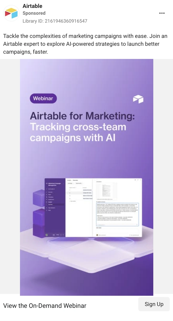
| Competitor Brand | Name of company | Notion | Airtable |
| Type of business | Productivity SaaS | Workflow/Project Management SaaS | |
| Ad platform | Meta | Meta | |
| Ad Type | Format used | Static + Graphic | Static + Webinar Visual |
| Hook | Copy/Scroll-stopper line | "Calling all SMB/Startup Pros: ⚡ Limited Summer Offer" | "Tackle the complexities of marketing campaigns with ease." |
| Emotion triggered | Aspiration + Scarcity | Relief + Curiosity | |
| Visual | Creative details | Bright yellow background, bold text, "Free 3 Month Trial" | Soft purple visual of product UI, webinar tag, stacked UI |
| Format | Brand-forward + Bold Typography | Product UI mockup | |
| Trust Signals | Yes (Clean brand, AI access tag) | Yes (Dashboard + platform preview) | |
| Copy | Main value message | "Think bigger. Build faster. Work together." | "Airtable for Marketing: Tracking cross-team campaigns with AI" |
| Overall tone | Aspirational and fast-moving | Helpful and structured | |
| Structure | Bulleted & spaced | Paragraph-based | |
| Offer | What's being offered | 3-month trial with full AI access (worth $12K) | Free webinar with expert AI training |
| Type | Free trial (Product-based) | Lead magnet (Webinar) | |
| Proof Elements | "$12,000 value" + brand trust | Product UI demo + expert-led session | |
| Objection Handling | "No credit card required" | None explicitly shown | |
| CTA | Button text | "Get offer" | "Sign up" |
| Type | Outcome-oriented | Action | |
| Friction Reducer | "No credit card required" | Implicit low-commitment (free webinar) | |
| Visual Prominence | Medium contrast on bottom right | Medium contrast on bottom right | |
| Landing Page | Message/copy/design match | Yes (headline, copy, value aligned) | Yes (webinar headline and flow) |
| Flow | Offer and theme aligned start-to-end | Headline and visual continuity present | |
| Psychology | Core emotion tactics | Scarcity, Aspiration, Value Maximization | Relief, Efficiency, Clarity |
| Emotional Response | FOMO, Excitement, Productivity boost | Confidence, Calm, Curiosity | |
| Conversion Notes | Strong urgency + aspirational tone + clear value stack | Clean design, specific problem-solution framing, webinar authority |
How to turn competitor analysis into execution
You’ve dissected your competitors’ ads and uncovered what makes them work. Now it’s time to put those insights to use. Here's how to turn your competitive analysis into campaigns that actually convert:
Immediate actions:
- Audit your top 5 competitors' current ad campaigns
- Identify the 3 most common patterns in successful ads
- Test adapted versions of winning hooks and formats
- Align your landing pages with your strongest ad messages
Long-term strategy:
- Build a swipe file of high-performing creative elements
- Monitor competitor campaigns for new approaches and seasonal trends
- Develop signature creative styles that differentiate while leveraging proven principles
- Create systematic testing protocols based on competitive intelligence
Founders and marketers who systematically analyze competitor creative not only save money on testing but also compress the time to market-fit. While others guess at messaging and design, you'll deploy strategies proven to work in your exact market.
This isn't about copying; it's about understanding the psychology that drives results in your category, then applying those insights to your unique value proposition.
Best tools to analyze ad creative (manual + AI)
Meta Ad Library, LinkedIn Ad Library, and TikTok Creative Center
These free hubs show every live or recently retired campaign on Facebook, Instagram, LinkedIn, and TikTok. Start by filtering for your vertical or typing in competitor names. Scroll through static images, carousels, and videos, and save anything that catches your eye in a shared document or swipe file.
By observing real-time winners, you stay on top of emerging trends — whether that’s the rise of ultra-short loops or bold text overlays. Once you build a collection of 30–50 examples each month, you can start spotting patterns: maybe product close-ups outperform lifestyle shots for your audience, or vertical video drives twice the engagement of square.
Pipiads and Motion
These paid scrapers crawl ad libraries and social feeds to deliver bulk metadata and thumbnail grids. Set up queries for competitor handles or industry keywords, then filter by spend, engagement rate, or creative type. Download CSVs that reveal which hooks, colour schemes, and CTAs dominate. You can then prioritise those angles in your A/B tests, saving weeks of trial and error and boosting your click-through rates from day one.
Madgicx
Connect your ad account with this paid competitor creative intelligence tool to pull in your own data, then compare your CTR, CPM, and conversion rates against industry benchmarks. Use its heat-maps to see which ad elements — images, headlines, buttons — drive the most clicks. By blending competitor scans with your results, you focus on the highest-impact tweaks.
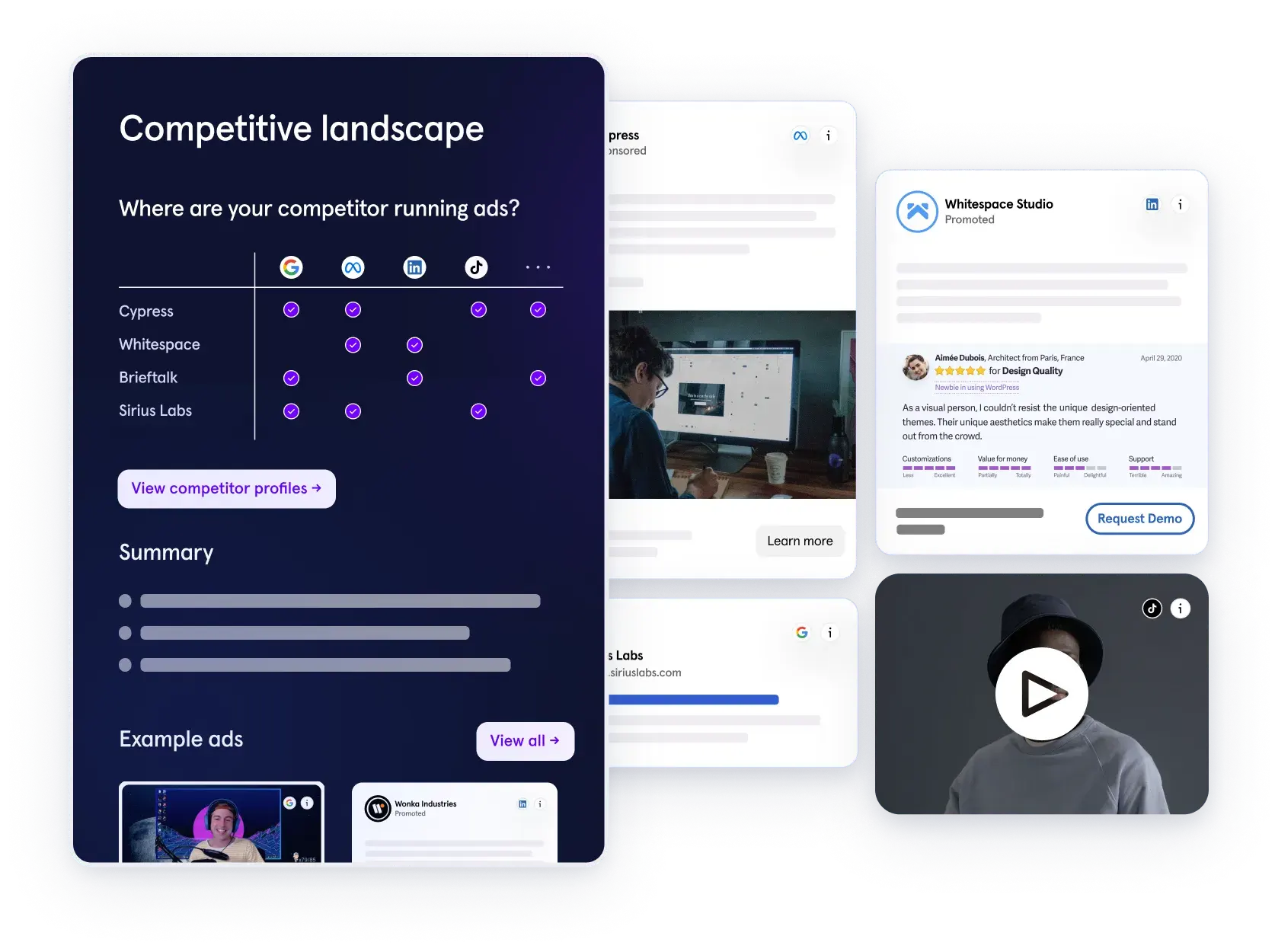
Competitor Ad Intelligence Tool (COIN) by Kaya
If you're analyzing ad creative with a performance mindset, especially to back insights with real metrics, Competitor Ad Intelligence tool (COIN) by Kaya offers a unique advantage. Unlike general-purpose ad libraries or creative scrapers that rely solely on publicly available data, COIN shares insights and data on different creative elements, such as formats, CTA, etc. It’s designed specifically for growth marketers and startup teams who want more than surface-level patterns.
While tools like Pipiads or TikTok Creative Center are great for idea discovery, COIN is built to answer the next question: “Which of my competitors’ ideas actually worked?” It ingests your ad data across channels and pinpoints which creatives are underperforming or breaking through — hook, visual, copy, CTA, and all. As a result, it helps structure your creative testing backlog using performance signals.
Key highlights:
- Discover where your competitors are actively advertising across Meta, Google, LinkedIn, and more
- Monitor which ad formats, calls-to-action, and landing pages they consistently reuse
- Analyze their messaging, positioning, and targeting to extract actionable insights
- Observe how frequently leading brands update their creatives and what direction their iterations are taking
In other words, COIN will help you turn teardown theory into execution.
Competitor Ad Intelligence Tool (COIN) by Kaya
Quick comparison
| Phase | Manual libraries | Paid scrapers / AI tools | COIN |
|---|---|---|---|
| Discovery | Meta Ad Library, TikTok Creative Center (see what’s trending) | Pipiads, Perceool (surface creative clusters at scale) | COIN only shows you ads that your competitors are running |
| Benchmarking | Swipe files, competitor notes | Motion, Madgicx (compare competitors' performance data) | N/A |
| Iteration | Ad-hoc A/B testing | Canva Magic Design, Pencil AI (auto-generate creative variants) | Help with identifying success patterns and signals |
Is AI-generated creative worth it? Here's how we use it
There’s a growing trend in performance marketing: “What if AI could just handle all the creative?”
With tools now offering instant headlines, one-click visual variations, and even auto-generated video scripts, it’s tempting to imagine a future where AI replaces the creative team altogether.
But when quality matters, as it should, can AI really deliver?
What we’ve seen across the industry
Many brands, especially those that are launching lots of ads and the bold ones, are starting to incorporate AI-generated creatives into their workflows. We’ve observed a surge in campaigns built using tools like Pencil AI, Canva Magic Design, and AdCreative.ai, and some of them do surprisingly well, especially for fast iterations or budget-conscious testing.
From what we've seen, AI works best when:
- The offer is inherently strong (e.g., “Get 3 months free, no credit card required”)
- Brand equity is strong
- The format is templated (carousels, statics, or simple animated loops)
- The prompt is highly specific (e.g., “Generate a mobile-first SaaS ad for startup CTOs with a ‘scale without hiring’ message”)
In these use cases, AI helps companies move fast but not always with finesse.
Why Kaya doesn’t use AI to produce final creatives
At Kaya, we don’t rely on AI tools to generate final ad creatives and for good reason.
Most of the time, audiences can tell when an ad is AI-generated. From slightly off-brand visuals to generic layouts or awkward copy, there’s often a lack of polish and nuance that subtly undermines brand perception. In high-stakes performance environments, that can translate into lower trust, weaker recall, and ultimately, reduced conversion rates.
It’s also rare for AI-generated assets to hit the expected output on the first try. Creative that truly resonates usually requires a deep understanding of the brand voice, sharp visual direction, and emotional precision — areas where AI still falls short.
Instead, we use AI-generated ads from the broader market as reference material for our design team. These serve as a pulse check on:
- Layout trends, visual styles, and evolving CTA treatments
- High-performing hooks or positioning angles from adjacent categories
- New patterns in motion, text hierarchy, or framing
This approach gives our designers a clear sense of what’s resonating, without compromising brand fidelity. It leads to better-informed creative briefs, faster turnaround, and higher-performing assets that still feel human, intentional, and brand-safe.
AI has become part of our creative workflow - not as a shortcut to final assets, but as a tool to unlock momentum. It’s a faster way to explore tone, structure, and concept - but the polish, storytelling, and brand nuance still come from our team.
Abhishek Gaurav, Performance and Product Marketer @Kaya
So, is AI-generated creative worth it?
Yes, but with caveats. AI is a great exploration tool, not a replacement for thoughtful design.
Used smartly, it’s a shortcut to inspiration. And when paired with a sharp creative team, AI references can elevate output, reduce guesswork, and spark fresh thinking.
In our experience, the best results come when AI helps shape the direction while humans bring the taste, intent, and nuance that truly make a creative work.
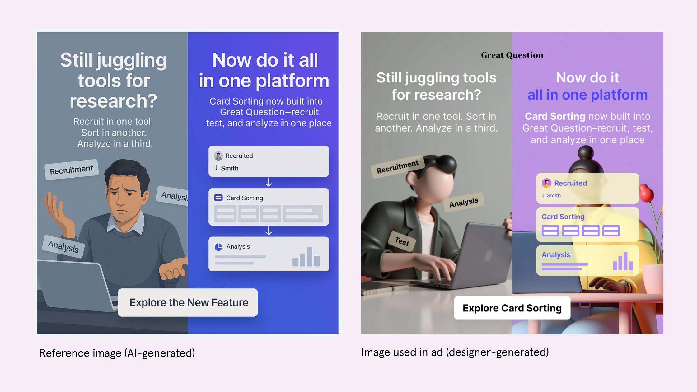
Reference image vs. final image used for ad
3 Creative frameworks to outperform the competition
Great ad creative doesn’t just look good, but brings in clicks. In fast-moving markets, startups need a structured way to develop, test, and iterate creative ideas that actually convert. That’s where creative frameworks come in. They turn messy brainstorms into replicable, testable systems. Below are three we use at Kaya, and they consistently outperform intuition-based guesswork.
1. The 3V framework: Visual, Value, Variation
Why it works:
This framework helps you design ads that don’t just look good, but connect immediately with the viewer and stay fresh over time.
-
Visual: Is the ad visually distinct in-feed? Does it stop the scroll within the first 0.3 seconds?
Example: Bright border, movement in the first frame, eye contact, bold overlays.
-
Value: Does the creative instantly communicate what’s in it for me? The clearer the value prop, the higher the engagement.
Example: “Cut onboarding time by 80%” or “Generate 5 pitch decks in under 2 minutes.”
-
Variation: Have you built enough creative variations to learn what works? Creative fatigue happens fast, so should your iterations.
2. HAFT: Hook, Angle, Format, Test
Why it works:
HAFT is a strategy-first creative planning tool. It breaks down every ad into its DNA—so you’re not just producing assets, but running experiments.
- Hook: What’s the first thing someone sees or hears? Is it curiosity-driven, emotion-led, or outcome-focused?
- Angle: What's the unique point of view or positioning? Think of it like your thesis.
- Format: Is it a static image, short-form video, carousel, or story? Choose based on platform behavior.
- Test: What are you trying to learn from this ad? Frame each asset as a hypothesis, not a finished product.
3. CTA Ladder: Soft → Medium → Hard
Why it works:
The call-to-action isn’t just a button—it’s a spectrum of readiness. The CTA Ladder framework helps you match intent with ask.
- Soft CTAs: “Learn more,” “See how it works” → best for cold audiences.
- Medium CTAs: “Try free for 7 days,” “Take the quiz” → good for warm, curious leads.
- Hard CTAs: “Book a demo now,” “Buy today” → works for retargeting or highly qualified leads.
How to use it: Design three versions of your ad with identical visual and copy structure, but rotate the CTA based on the audience segment. Run all three, then double down on the one that gets the best downstream performance (not just CTR—look at signup or conversion rates).
Instead of replacing creative freedom, these frameworks help channel it. When you apply structure to ideation, you don’t just make more ads. You make better, smarter, higher-converting ones. And when every dollar matters, that’s your edge.
FAQ
What is the meaning of creative advertising?
What is ad copy and ad creative?
What is the role of an ad creative?
Final thoughts
If your ads feel flat while competitors seem to effortlessly churn out scroll-stopping creative, you're not alone. But this isn’t a talent gap, it’s a process gap. Great creative isn’t magic. It’s repeatable, it’s testable, and it’s driven by structure.
We’ve walked through how to break down competitor ads, the tools to support that analysis, and the frameworks to turn inspiration into high-performing assets. But here’s the truth: doing all of this manually — saving ads, tagging patterns, tracking variants, interpreting performance — is time-consuming. Most teams don’t need more effort. They need better leverage.
That’s where using a third-party creative intelligence tool makes a real difference. The right platform doesn’t just help you find interesting ads; it helps you understand why they work. It clusters patterns, flags fatigue, highlights breakout angles, and benchmarks your performance against the market.
When your process is built on this kind of insight, creativity becomes a strategic asset. And your team stops asking “Why do their ads work better?” and starts saying, “Here’s exactly what we’ll test next and why.”
Let that be your creative advantage.